PETERSBURG TENNIS ACADEMY
PETERSBURG TENNIS ACADEMY
BRAND IDENTITY / WEB DESIGN / SQUARESPACE CUSTOMIZATION
PROJECT OVERVIEW
The primary goal of this project was to design a user-friendly website for a tennis academy, incorporating e-commerce functionality. This feature allows clients to purchase classes online with ease, enhancing the booking process and overall customer satisfaction.
In addition to website development, we established comprehensive branding guidelines. This ensures the tennis academy's identity stays consistent and impactful across all platforms, covering aspects such as color schemes, logo usage, typography, and more.
DELIVERABLES
Developed a fully functional, mobile-responsive website with integrated e-commerce functionality for seamless online transactions.
Branding assets and guidelines
E-mail templates
PROJECT WORKFLOW
01 / RESEARCH
In the initial phase, my focus is on creating a cohesive visual direction for the brand and its website. To accomplish this, I begin by collecting essential information from the client through questionnaires. Then, I conduct comprehensive industry research. This helps identify market niches, define customer personas, and shape the brand's messaging.
02 / WIREFRAMING
With the branding guidelines approved, my attention shifts to designing the website wireframes. This process encompasses the creation of a sitemap, identification of an intuitive user flow, and the development of prototypes for key pages using Figma.
03 / FINAL DESIGN
After receiving client approval on the wireframes, I begin building the actual website on Squarespace. To ensure client satisfaction, I provide three rounds of revisions.
RESEARCH / WEB DIRECTION
Initially, I undertook a deep dive into the client's business, scrutinizing their mission, values, and unique selling propositions. This examination enabled me to encapsulate the essence of their brand and to create a congruent online presence.
Subsequently, I executed comprehensive market research to pinpoint their target demographic, understanding their preferences and online patterns. This examination of competitors and industry trends furnished valuable insights to distinguish the client's website, making it more attractive to their target audience.
In the final stage, I concentrated on enhancing the website's design, user experience, and content to guarantee it effectively articulated the brand's message and mirrored its values. With the union of exhaustive research and strategic web direction, the resultant website is uniquely positioned to differentiate itself within the client's niche, engage their target audience, and create a memorable impact.
STYLE GUIDE
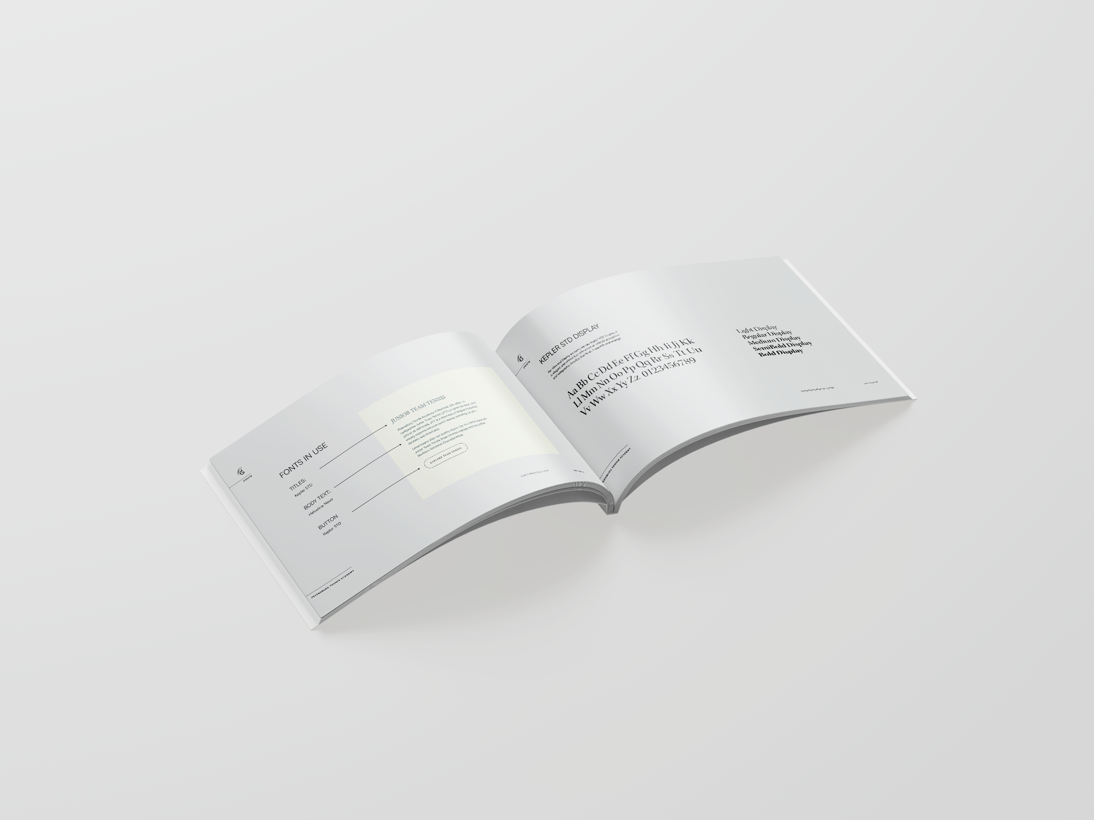
Guided by the client's brand vision, our approach pivoted around the notions of accessibility and professional excellence. We chose a neutral color palette complemented by two accent hues. When paired with a typography set that is both elegant and approachable, it articulates the brand's identity effectively. The resulting style guide achieves a perfect blend of sophistication and accessibility. This ensures the brand connects with a diverse audience, while upholding an elevated level of professionalism.
TYPOGRAPHY & COLORS
LOGO SET
I created branding mockups to provide the client with a preview of how their logo could be applied across various products and marketing materials.


